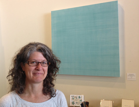
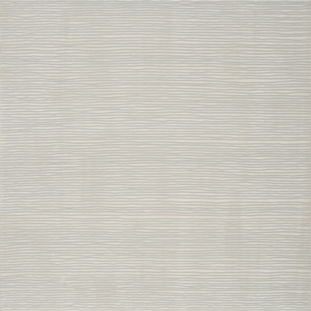
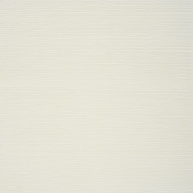
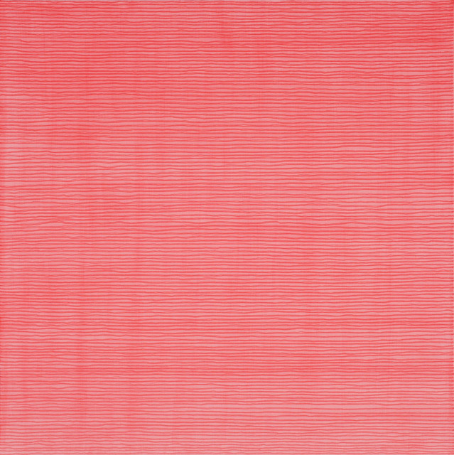
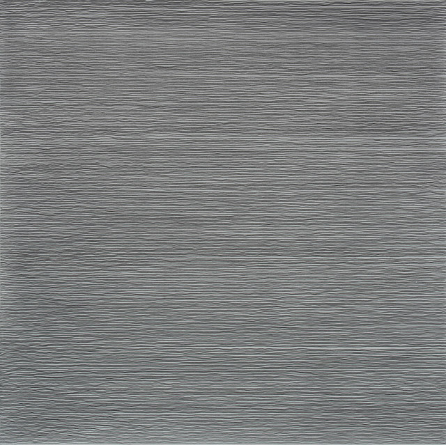
California Bay Area Contemporary Artist, Lisa Espenmiller“The Way”, uses line, movement, and space to focus intent on material and repetition of pattern, in a meditative process. Hers is a controlled technique akin to writing on a scroll. Espenmiller draws horizontal ink lines, one after the other, until the entire surface of canvas or paper becomes a field of meditative resonance. The lines and washes of color in her paintings are visual descriptions of the chi or breath-energy that flows through all things.1
“I have this notion that art occurs in the process of life itself, and you don’t have to go outside of the context of your own life. It’s all there, and you just tap into it. You open up to it. You have to make yourself available to possibilities.”
— David Ireland, he Art of David IrelandThe Way Things Are2
Lisa Espenmiller “Begin in the small,” 2013 acrylic and ink on canvas over panel 20 x 20 inchesLisa Espenmiller “Born in the void” 2013 acrylic and ink on canvas over panel 20 x 20 inchesLisa Espenmiller “Know when to stop”, 2012 acrylic & ink on canvas over panel 24″ x 24″Lisa Espenmiller “Nothing slips through”, 2014 acrylic & ink on canvas over panel 30″ x 30″Lisa Espenmiller “Of its own accord “ acrylic & ink on canvas over panel 24″ x 24″Lisa Espenmiller “Some breathe gently”, 2013 acrylic & ink on canvas over panel 36″ x 36″
Artist’s Statement
The lines and washes of color in my paintings and works on paper, visual descriptions of the chi or breath-energy that flows through all things, seek to sober and quiet the mind. When the mind quiets it becomes susceptible to inspiration, to movement from the microcosmic to the macrocosmic. Whether the body of work attempts to depict the inner scenery of breath-energy (The Way, Where you come from), the ever-shifting inner and outer landscape (the groundless ground), or talismanic power (chant), the goal is to engender a stilling of the hyperactive mind so the viewer can recognize the existence of a source that transcends human or divine authority – what Lao Tzu refers to as “dark-enigma” – the chi-tissue of empirical reality and the empty opening of consciousness itself.
The paintings and works on paper function both as mirror and window. Viewers are encouraged to stand before each one allowing the piece to offer a reflection of what’s inside or a view into another layer of reality. Think of them as modern mandalas or yantras.
As in meditation, my process requires that I remain rooted and immersed in the realization of the piece for a focused, uninterrupted period of time. There is little time or space for the logical mind to intervene in an attempt to control the outcome. The pace of each line, the movement of the brush or pen are guided by intuition and “no-mind,” accepting and trusting what presents itself in each fluid, changing moment.
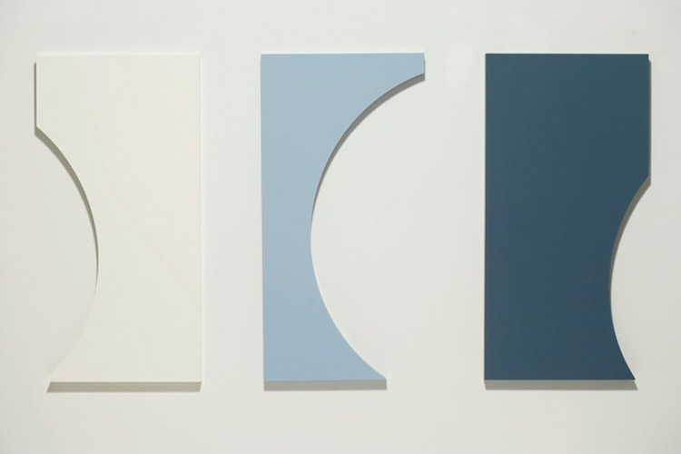
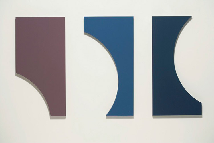
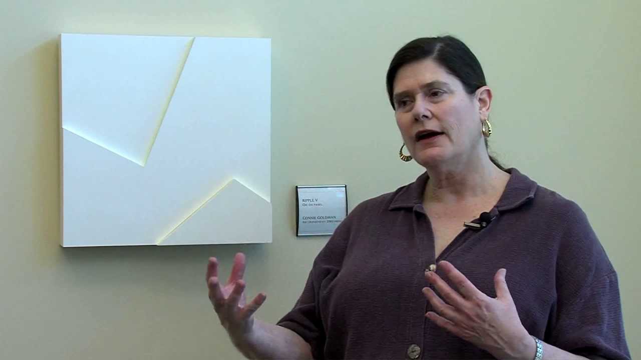
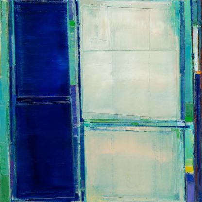
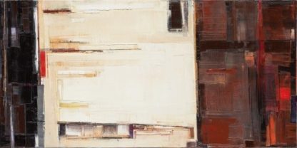
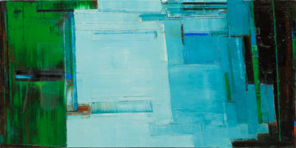
Much of Bay Area Artist, Connie Goldman’s1 work relates to upset equilibrium and the tension between stasis and flux. Her work is reductive and abstract yet deeply personal. As with equilibrium, it is not static but always on the brink of changing in one form or another.
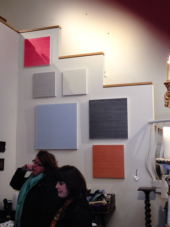
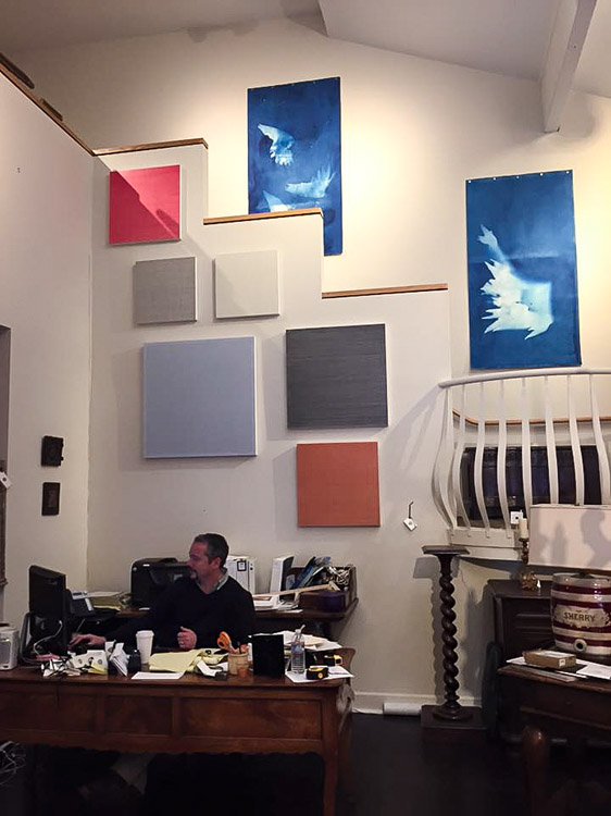
As part of our Temporary Contemporary Fine Arts Exhibit Garden Court has introduced Connie Goldman’s abstracts to our Vermont Center Gallery. Combining contemporary alongside the antique reflect the juxtaposed styles of designers and collectors today. Our Fine Arts Exhibit is presented by Art Consultant, Laurie Ghielmetti Interior + Art2.
Connie Goldman, Phasis XI, 2007, Oil-on-panel, 32 in x 60 in.
Connie Goldman, Phasis X, 2007, Oil-on-panel, 32 in. x 60 in.
Phasis Series
Phasis n. a manner, stage, or aspect of being; phase .
Phase n. (1) any of the major appearances or aspects in which a thing of varying modes or conditions manifests itself to the eye or mind (2) a stage in a process of change or development (3) the particular appearance presented by the moon or a planet at a given time.
Lunar Phase – Lunar phase refers to the appearance of the illuminated portion of the Moon as seen by an observer, (usually) on earth.
The multiple panels allow for time elapsed and changing points of view. These pieces speak to the constancy of change, the predictability of uncertainty. 3
The creative process for Ms Goldman often begins with sketches and words. Phasis began with sketches ( At point 1:25 in the video above ) and a rift on ‘Phases of the Moon’. A self-confessed ‘Geek’, Ms Goldman loves words. She will sit and read the dictionary. “Language, music, poetry”, she says,”has a certain meter to it, a regularity like our own heartbeat”. She’s also a “Quote Junkie” having collected thousands of them over the years. These quotes serve as a type of shortcut to express ideas and a personal point of view. Ms Goldman read a few of her favorite quotes to Blogger, Phillip J. Mellen of Ahtcast in a 2013 interview. 4
Robert Henri5 (leading figure in the Ashcan Art Movement6 of the early twentieth century): “The object isn’t to make art, It’s to be in that wonderful state which makes art inevitable”7
Frank Lobdell8: “Sometimes it’s not what one puts into a painting but rather what one leaves out that makes a compelling picture.”9
Pearl Buck10: “The truly creative mind in any field is no more than this: a human creature born abnormally, inhumanly sensitive. To them a touch is a blow, a sound is a noise, a misfortune is a tragedy, a joy is an ecstacy, a friend is a lover, a lover is a God, and failure is death. Add to this cruelly delicate organism, the overpowering necessity to create, create, create, so that without the creating of music, or poetry, or books or buildings or of something of meaning, their very breath is cut off. They must create — must pour out creation. By some strange unknown urgency, they are not really alive unless they are creating. “11
Patti Smith12: “In art and dream may you proceed with abandon. In life, may you proceed with balance and stealth.”13
Marcel Proust14 : “The real voyage of discovery consists in not seeking new landscapes but having new eyes.”15
Anais Nin16: “There came a time when the risk to remain tight in the bud was more painful than the risks it took to blossom.”17
Constantin Brâncuși18 : on Abstraction. “When you see a fish, you don’t think of its scales, do you? You think of it’s speed, it’s floating, flashing body seen through the water. If I make fins and eyes and scales I would arrest its movement. Give it pattern or shape of reality. I just want the flash of the spirit. “19
Paul Cézanne20: “Painting is damned difficult. You always think you’ve got it but you haven’t. I could paint for a hundred years, a thousand years, without stopping and I would still feel as though I knew nothing.”21
Bay Area Abstract Artist, Connie Goldman.
Asked to apply three to five words to describe her work, Ms Goldman responded, “Quiet, understated, musical. My work is far-reaching, referencing other disciplines, language and music; the spaces that exist in music, haiku, proportion.” The creative process is never-ending. Of her work, Ms Goldman observes: “You can’t master it. You can’t completely master it.”
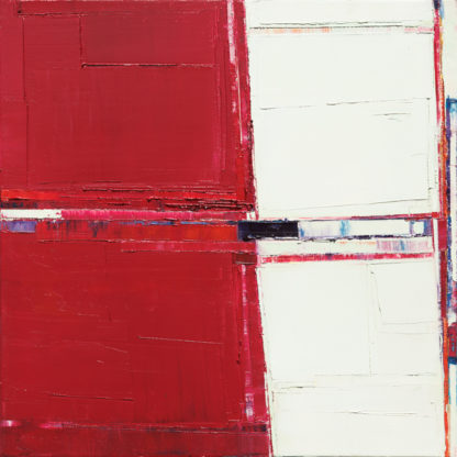
Connie Goldman, Captive I, 2006, Oil-on-panel, 53 in. x 43 in. x 2 in.
Connie Goldman, Captive II, 2006, Oil-on-panel, 48 in. x 39 in. x 2 in.
Artist Statement
Using a minimalist vocabulary and a reductive aesthetic that emphasizes the importance of space, rhythm, structure, and relations, I make works of art that are concrete and essential approximations of my own emotional and intellectual experiences. The work reflects my interests in architecture, music, science, sculpture, and painting as well as the threads of commonality that run between them.
The tendency or desire to gravitate toward unity and stability is in opposition to the urge toward independence, transition, and growth. My work evokes this same tension, the dynamic that underlies my own existence. I see each piece as being analogous to the rhythmic and contradictory forces of stasis and flux that propel my world toward both constancy and change.
Patricia Lee ‘Patti’ Smith(born December 30, 1946) American singer-songwriter, poet and visual artist an influential component of the New York City seventies punk rock movement. ↩
Constantin Brâncuși( February 19, 1876 – March 16, 1957 ) Romanian sculptor, painter and photographer; considered a pioneer of modernism, one of the most influential sculptors of the 20th-century, ‘patriarch of modern sculpture’ ↩
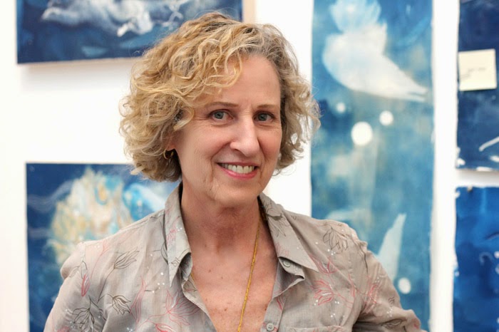
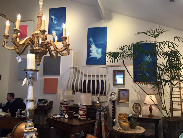
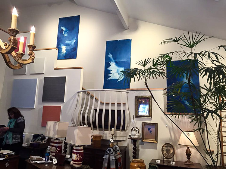
Bay Area Artist, Ann Holsberry, works in cyanotype1, a kind of photographic printmaking that yields a rich Prussian blue combined with gouache (an opaque watercolor paint). She uses this process in a painterly manner to convey vast impressions of the oceans and cerulean skies in her Migration series which is now on display at Garden Court’s Vermont Center Showroom presented by Art Consultant, Laurie Ghielmetti Interiors + Art2
Holsberry’s Migration series is fluid and ever-changing. Using a combination of source materials—her Qi Gong meditation and movement practice, images from the Hubble Space Telescope, old maps, and her collection of nests, feathers, and other ephemera—Holsberry creates stunningly beautiful works that engage the viewer and encourage deeper reflection. Her pieces draw inspiration from nature and her fascination with migratory birds—which often appear as metaphorical symbols in her work —but her meditations on migration also delve deeper. Her works map emotional territory born from semi-annual trips to France.
Being somewhat nomadic by nature, I like to move about, establishing little studios wherever I land for a while. For the past decade, I have spent part of each year living and working in France, where I find inspiration in the rich cultural history and beauty of Europe – in particular, Paris. It is a place where serendipitous discoveries seem to lead me in unexpected creative directions.3
Additionally, she is moved by the experience of seeing family members and the increasing numbers of people being pushed and pulled around the globe; movement that needs to be expressed. Though deeply personal, Holsberry’s work maintains an important universality, drawing on the individual, yet shared, experience of moving from one place to another.4
Ann Holsberry: Hover, 2014, Cyanotype & Gouache on paper, 72 in. x 38 in.
The name cyanotype was derived from the Greek name cyan, meaning “dark-blue impression.” 5 The cyanotype process, together with a number of other, older photographic processes, was revived by contemporary photographers in the 1960s The basic cyanotype recipe has not changed very much since Sir John Herschel introduced it in 1842.
Ann Holsberry: Towards the Seas 1, 2014, Cyano 72 in. x 38 in.Ann Holsberry: Towards the Sea 2, 2014, Cyno 72 in. x 38 in
MIGRATION
I am fascinated by the movement of humans and animals across the globe, and am drawn to illustrate their webs and networks of transit. I am also fascinated by cosmology, in particular the way the earth and other heavenly bodies travel through space. Accordingly, my current work is inspired both by the movements of planets and stars, and by the complementary movements of animals and people across the earth.
To express these ideas, I work with cyanotype, one of the oldest alternative photographic processes. Cyanotype was the original process by which blueprints were created, and its blue color evokes skies and oceans, giving the works a vast, dreamlike, atmospheric quality. I begin each piece by painting the chemicals onto paper in the darkroom in varying patterns, after which I expose the prints in outdoor sunlight, sometimes working in locations over which flocks of migratory birds fly, or near oceans and rivers where whales and fish are migrating. Following the exposure process, I add gouache, ink, pastel, or wax to some of the works to further develop them as paintings.6
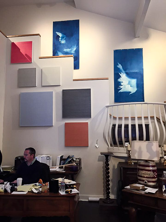
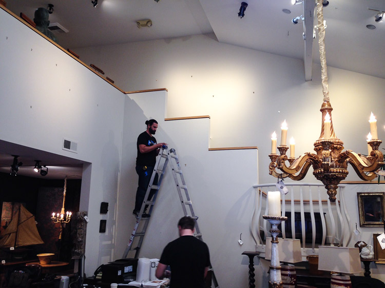
One of our commitments since moving into our new Vermont Center Showroom has been simply, show how modern and antiques can be used to create gorgeous and eclectic interiors.
We’ve been fortunate to work in tandem with Fine Arts Consultant and Interior Designer, Laurie Ghielmetti Interiors in our efforts.
Combining modern with antique reflects the real world of interior design today and we are happy with the results.
.. more to come. Meanwhile, we hope you’ll stop in to view our temporary contemporary exhibit at 151 Vermont Street in San Francisco.
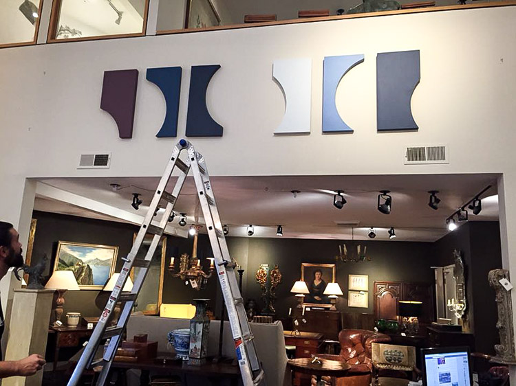
Special exhibit: Contemporary Art and Fine Antiques photo: Laurie Ghielmetti
Special exhibit: Modern Art and Fine Antiques
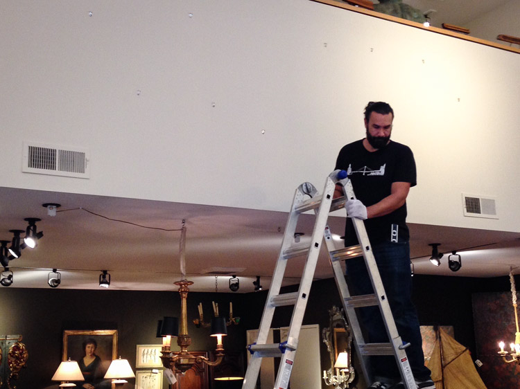
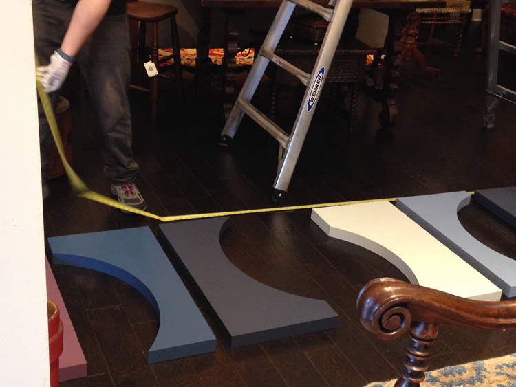
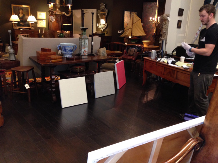
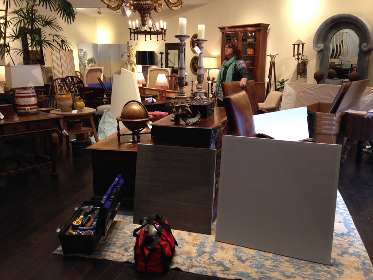
Special exhibit: Contemporary Art and Fine Antiques , hanging the new exhibit for 2016
Special exhibit: Modern Art and Fine Antiques, arranging art pieces for the new exhibit.
Special exhibit: Contemporary Art and Fine Antiques, preparations for the new contemporary art exhibit at Garden Court Antiques.
Special exhibit: Modern Art and Fine Antiques photo: Laurie Ghielmetti
Special exhibit: Contemporary Art and Fine Antiques
Special exhibit: Modern Art and Fine Antiques
Special exhibit: Contemporary Art and Fine Antiques photo: Laurie Ghielmetti
Special exhibit: Modern Art and Fine Antiques photo: Laurie Ghielmetti
“West Point, New York” is one scene from the scenic wallpaper “Views of North America” first produced by the French firm Zuber et Cie in 1834. This scenic contains 32 panels and shows some of the natural wonders of the continent: New York Bay, Boston Harbor, West Point, & the natural bridge of Virginia. Scenic wallpapers were introduced around 1804 and remained popular with new designs being introduced until 1865. Scenic wallpaper allowed the viewer to visually access an historical moment during the July Monarchy (July 1830- 1848) in which America was idealized as the future of France.
“Vues d’Amérique du Nord” offers an idealized view of Jacksonian America as conceived by its designer, Jean-Julien Deltil, who may never have visited the United States and based hiswork on the designs of Jacques-Géard Milbert, and designed the paper for Jean Zuber et Cie in 1834. Zuber crafted the paper using 1,700 hand-carved blocks and 223 different colors. The Frenchman’s scenes of free blacks engaged in trade, dressed in finery, and residing happily alongside their white counterparts presented an idealized (bordering on utopian) view of the newly born country, which may have been intended as a slight to the English as much as it was a glorification of the Americans’ nascent democratic nation.
In 1852, Jean Zuber took advantage of a nationalist wave in the US and republished “Views of North America”, as “The War of American Independence”. He substituted foreground figures so the Boston Harbor became the Boston Tea Party. Peaceful scenes became battlefields.
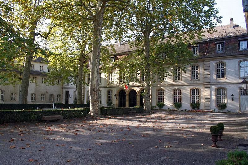
The Zuber Headquarters, Rixheim , France
Between 1804 and 1860, Zuber Manufacture de Papiers Peints produced more than 25 of these panoramas wallpapers. The process is labor-intensive, requiring hundreds of hand-carved pearwood blocks. Unfortunately, the method of carving the blocks is virtually a lost art, a set for one panorama took up to 20 engravers a full year to complete. For some panels, 70 to 80 different woodblocks might be required, applied one by one in an exacting order. To create the horizon, four people work simultaneously using a complex hand-brushing technique, producing a velvety matte. The papers are then refined by hand and dried on huge racks. Zuber et Cie’s wallpapers are astonishing in their scale and painterly attention to coloration, shading, and detail.
It was reported that Zuber’s wallpapers were so renowned that King Louis Philippe honored him with the Legion of Honor in 1834, the year that ‘Scenic America’ was printed. The Zuber blocks were recently deemed an historic monument by the French government.
Fascinating & beautiful video from the Manufacturer, Zuber et Cie, which shows us how these these large-scale scenic block-print wallpaper panels are made using the same craftsmanship and time-consuming artistry that has defined their work for centuries. ** We recommend you turn the audio off, there is no narration and the music is, well, lacking. :)
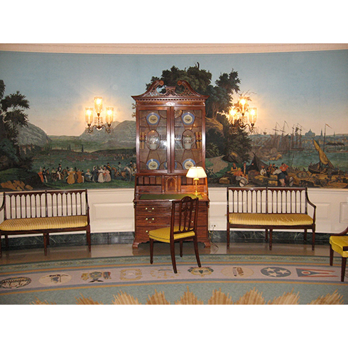
The White House.
Jacqueline Kennedy was so taken by the beauty and historical significance of these wallpaper block print panels that she had one installed in the White House in the 1960’s The Diplomatic Reception Room in the White House is one of three oval rooms in the White House. It was refurbished in 1960 during the Dwight Eisenhower administration in the style of the Federal period with antiques selected by New York interior designer Michael Greer. In 1962, with advice from American antiques expert Henry Francis du Pont, First Lady Jacqueline Kennedy had the room papered with antique French scenic wallpaper produced by Jean Zuber et Cie in Rixheim (Alsace), France c. 1834. The Zuber wallpaper, titled Scenes of North America, and features scenes of Boston Harbor, the Natural Bridge in Virginia, West Point, New York, Niagara Falls, and New York Harbor.
The sweeping panorama on the elliptical walls provide a sense of space negating the lack of windows. Additional Federal-era furniture was acquired, and upholsteries and the carpet furthered a soft gold and blue decor.
~ [Source: Author: Paulus Swaen]
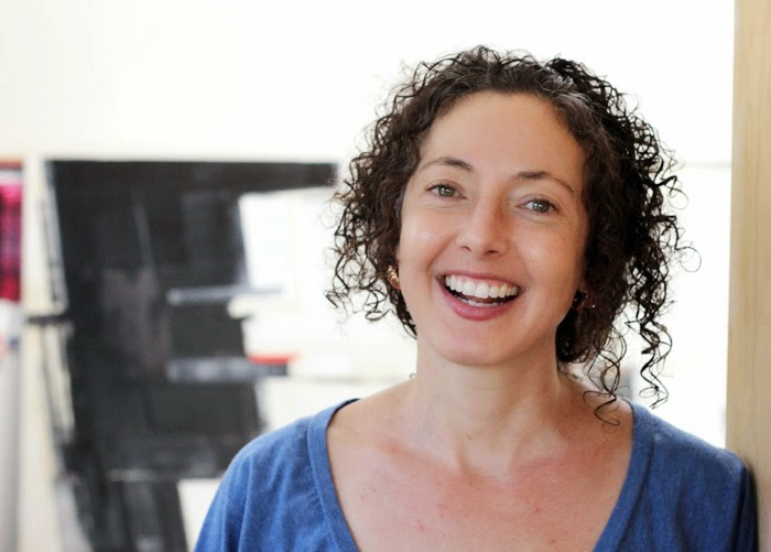
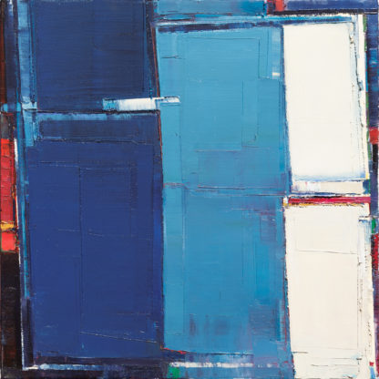
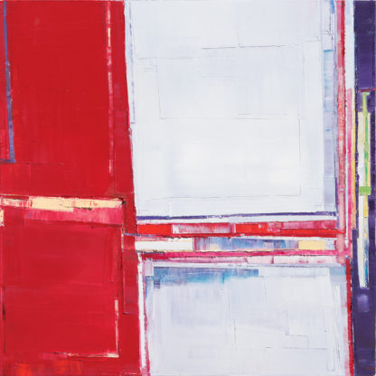
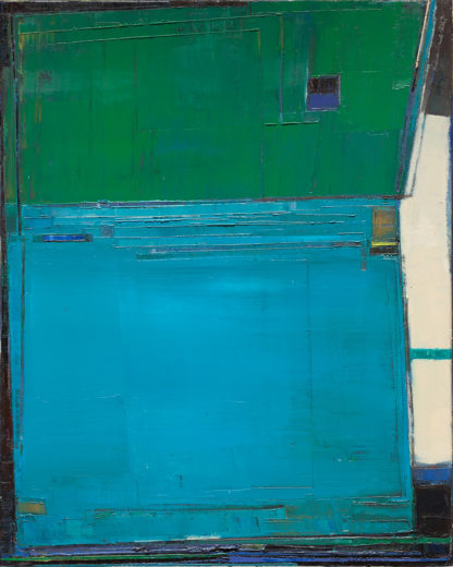
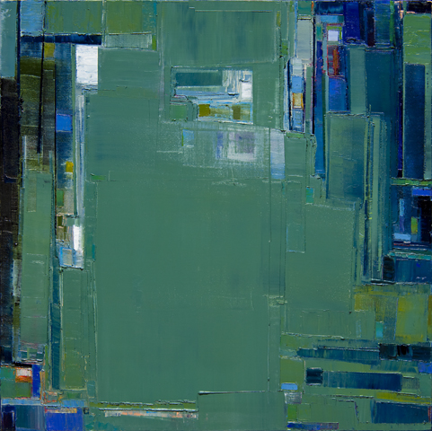
San Francisco Bay Area Abstract Impressionism: Artist, Maya Kabat
Architectural forms, geometric abstraction, and the tension between balance, color & form inspire California Abstract Artist, Maya Kabat. The urban landscape of California’s Bay Area and the unconventional tools she uses further informs her art.
I paint to create a language for things I can’t articulate, to address the questions that don’t have answers.
For Kabat, the work is an ongoing process of refinement and regeneration. She uses drywall tools, to layer, build and add texture to her canvases. With seeming impetuosity, she may introduce a dissonant color or destructively wipe a canvas entirely clean to start over. She works fast and prolific, obsessive almost. The process dictated by an imperative inherent within the medium: She can only work as the paint is malleable. “Time” is not necessarily her friend.
[..] it means I really have to be fully committed to paint one of my pieces. I can’t leave it if it’s not done.
Maya Kabat – “Urban Field 18”, oil-on-canvas, 24 x 24 in.
Maya Kabat, “Urban Field 13”, oil-on-canvas, 36 x 36 in., 2015
Maya Kabat “Upper Span 3”, oil-on-canvas, 24 x 36 in.
Maya Kabat: “Living Cities, Oakland 5”, oil-on-canvas, 30 x 30 in.
Maya Kabat “Urban Field 17” 24 x 24 in., 2015
Maya Kabat “Two Cities 5”, 24 x 48 in., 2013
Maya Kabat “Two Cities 2”, 24 x 48 in., 2013
Maya Kabat, “Strike Fault 4” 30 x 30 in., 2008
Maya Kabat“started out as a kid who just needed to make things”. As a young girl she began knitting with her grandmother. She carried that skill on through high school and into college. “I always loved thread.”
She began “quilting” as an undergrad finding inspiration in improvisational quilters such as the unique and important African-American Gee’s Bend quilt makers and the renowned African-American quiltmaker, Rosie Lee Tompkins. The asymmetry and the improvisational approach to pattern, shape and color continue to influence her work.
Prior to graduate studies at the University of California, Davis Ms. Kabat began painting because she felt a need to learn about color in ways that quilt-making could not afford. Initially, she began primarily painting landscapes, understanding space — using the basic tools to construct realistic space.
Her present work can be considered “urban landscapes” embodying that sense of push & pull with space, of dark & light, of small worlds of pattern, color & texture, “just like the city itself”.
Artist’s Statement
In this series of paintings I explore the changing form and reality of my daily life through an examination of constantly shifting external and internal environments. Referencing the urban landscape where I live, I examine how with the changing seasons, my surroundings shift with the light, the weather, the passing of time. Plates of earth move and my house shakes and then settles. The horizontal and vertical structures around me turn slightly off-kilter with time and wear, as the cracks in the hard cement remind me that nothing is fixed. The built environments in which I dwell, like my body and my mind, are not static.
My paintings play within this space between chaos and order, structure and formlessness; between a world that feels solid, unchanging, and safe, while simultaneously knowing that nothing is. The result is the visual record of the struggle to hold these two realities at once; to create a language for the uncertainty and precariousness of life without crumbling beneath the weight of the understanding.
Using a range of scraping tools I create my surfaces with stripes, gouges and flat slabs of paint, as I apply, scrape away, and reapply paint. Earlier layers are exposed and then covered, as the painting is built, cut away and edited. I see the process of painting itself as an excavation. I work to expose the truth of the painting and to locate some truth about myself within it. I paint to create a language for things I can’t articulate, to address the questions that don’t have answers.
Maya Kabat received a Master of Fine Arts in 2000 from the University of California, Davis. Notable exhibitions include a solo show at the Caffe Museo at SFMOMA in 2012, a solo show at the SFMOMA Artists Gallery, San Francisco, California in 2009, and a two-person exhibition at 5 Claude Lane Gallery, in San Francisco, California which was reviewed in Art LTD. Magazine in September, 2011. She was a founding member of the artist-run space, Mercury Twenty Gallery, in Oakland, California and served as President on the Oakland Art Murmur Board of Directors in 2011-2012. For more on Ms. Kabat’s substantial background [..] ^jh
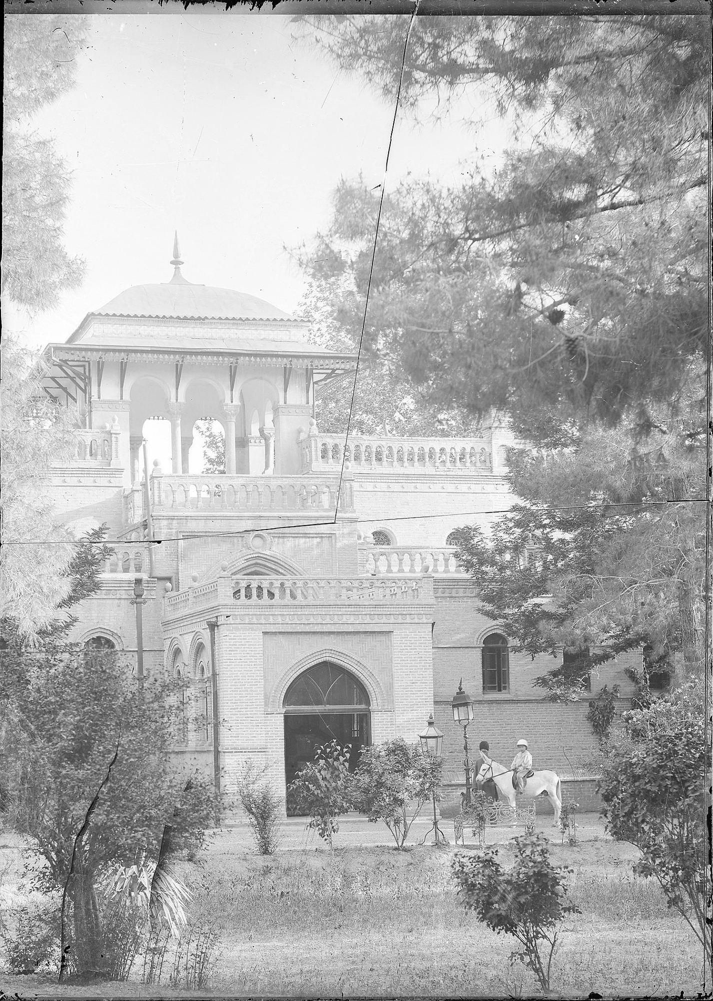
The photograph is taken from inside the embassy’s garden (south), depicting a child on horseback with an attendant. The photograph was turned into a postcard at approximately the same time.”
Interior of British Embassy in Iran.
Interior, British Embassy in Iran
Interior British embassy in Iran
Images via Smithsonian: Handwritten information on slip of paper (from a 1943-1944 cash book, produced by the Bathni Brothers, Tehran) reads, “27) Interior of British Embassy.” [Myron Bement Smith Collection, Subseries 2.1: Islamic Archives History, Collection Information
– Myron Bement Smith handwritten caption in English reads, “47.P; Box 41.6: Tehran. British Embassy. Interior. (# 27).” [Myron Bement Smith Collection, Subseries 2.1: Islamic Archives History, Collection Information; Box 60; Folder 44: 47 P: Antoine Sevruguin, glass negatives, Iran
The British embassy in Tehran was constructed by British Architect. James Wild (March 9, 1814 – November7, 1892) on a piece of land acquired by the British government in 1860. The construction of the building lasted for almost sixteen years, the bulk of which was constructed from 1871 to 1876. Construction was complicated by Wild’s decision to transport the roof and other materials, such as glass, from the UK. Part of the roof was lost at sea in 1871, and two caravans of 367 camels transporting other materials were variously robbed by bandits and held to ransom by excise official and a ship carrying glass and joinery caught fire at the port city of Bushehr.
The British Embassy to Iran was designed from the South Kensington Museum (today the Victoria and Albert Museum) in London, in 1869. James Wild had a strong reputation as a specialist in Middle Eastern architectural design, which he had studied and extensively drawn while living in Egypt between 1842 and 1848. He was sympathetic to the general principles laid out in Jones’ Grammar of Ornament. His Tehran embassy buildings are representative of the “controlled eclecticism” typical of the Design Reform movement broadcast from South Kensington.
Wild’s first proposal for the State Rooms was rejected, apparently because he had selected a “Persian” style: this was not considered workable for Britain’s official profile in Iran, where Britain and Russia struggled for political influence and status at the Qajar court. After a long hiatus, Wild’s second (more conservative) scheme for the State Rooms was approved: this also offered a British assimilation of a “foreign” style, echoing the eighteenth-century British assimilation of Greek and Roman architecture exemplified by neo-classical practitioners such as Robert Adam.
In 1906, the embassy played a key role in the uprising which led to the establishment of a parliament in Iran, when well over 10,000 Tehran people took refuge in the compound.
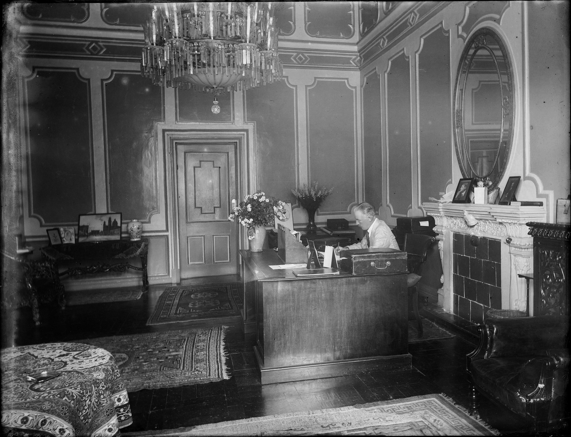
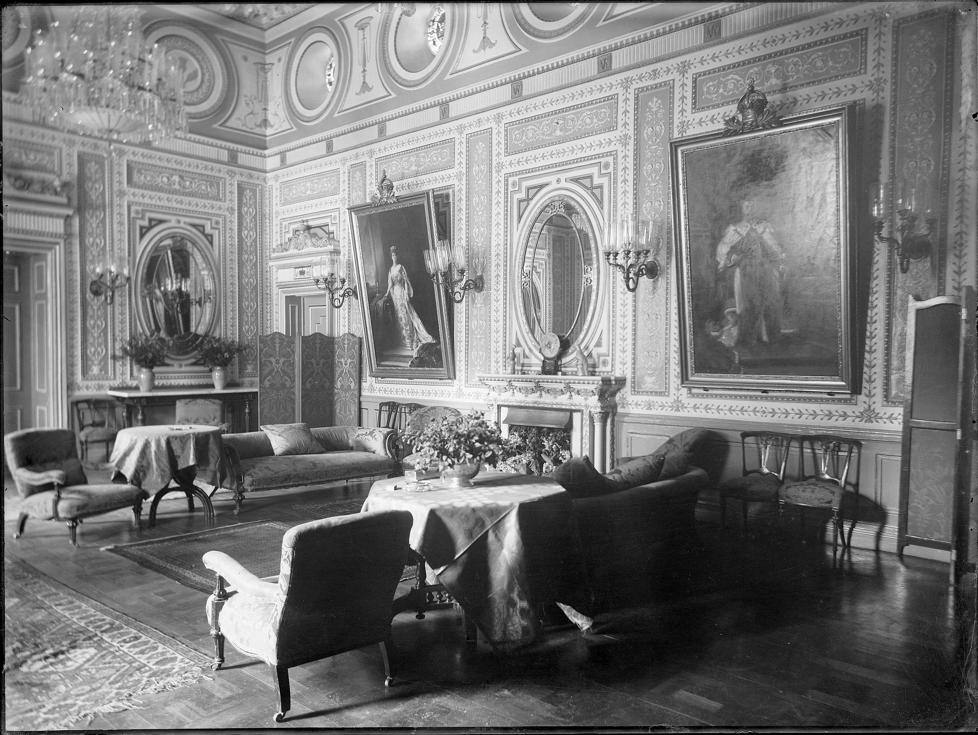
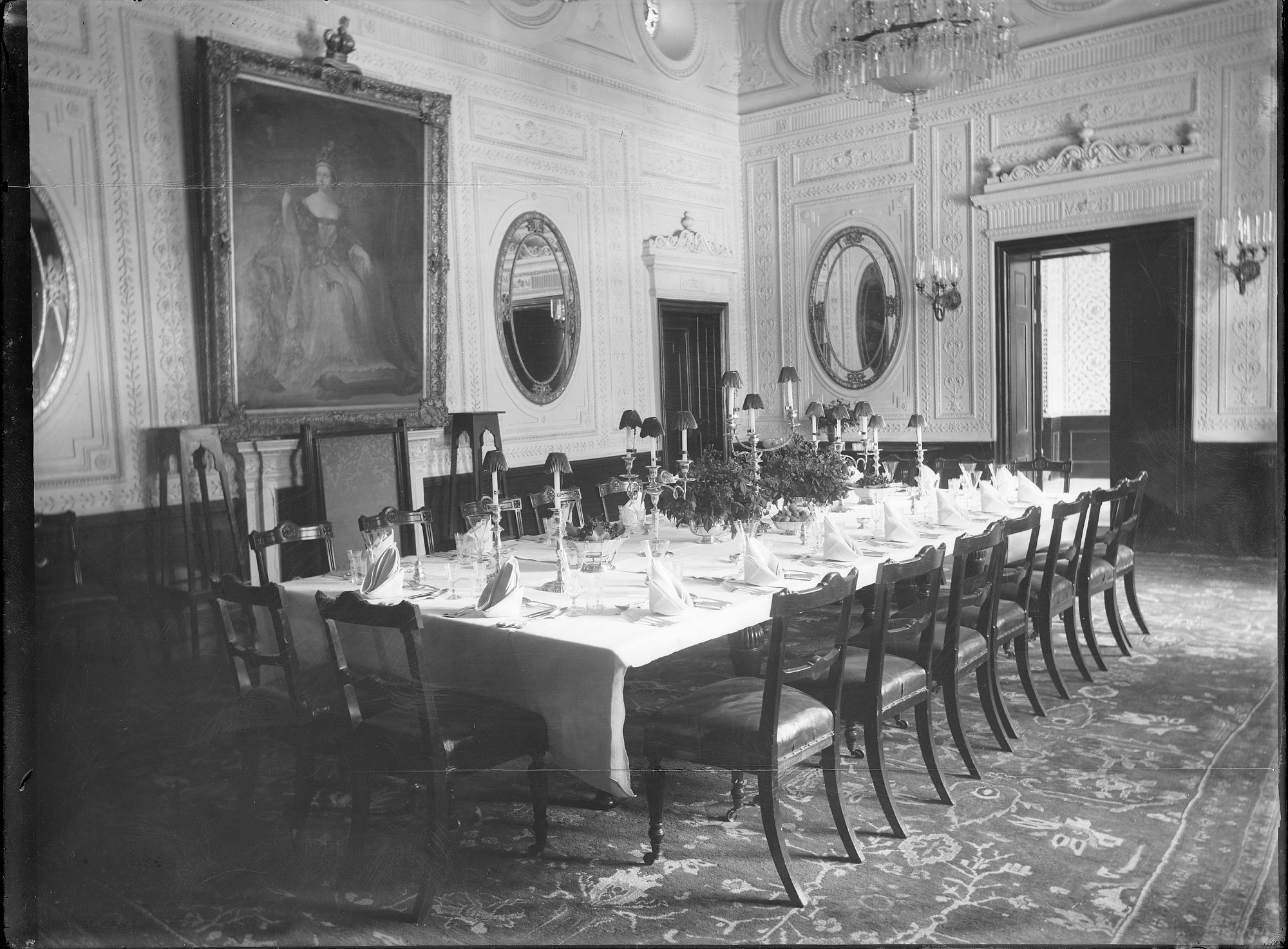
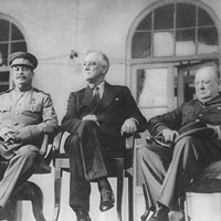
Stalin, Roosevelt and Churchill at the Tehran Conference 1943
Churchill, Stalin and Roosevelt met at the British embassy in Tehran for the first time to discuss the progress of the war and the future of Europe, even though the bulk of the meetings were at the Soviet embassy. Ambassador, Geoffrey Adam, and his wife, Mary Emma, had restored the interiors the British embassy in Tehran to their former historic glory. Tables and chairs had been repositioned exactly as they were in 1943 when Churchill, Stalin and Roosevelt and their aides met at the Tehran Conference that failed to end the second world war. (Churchill and Stalin reportedly drank whisky and got on famously; Roosevelt looked on disapprovingly.) ^jh
The British Embassy in Tehran
198 Ferdowsi Avenue
Tehran
11316-91144
Iran
Telephone:
+44 20 7008 1500
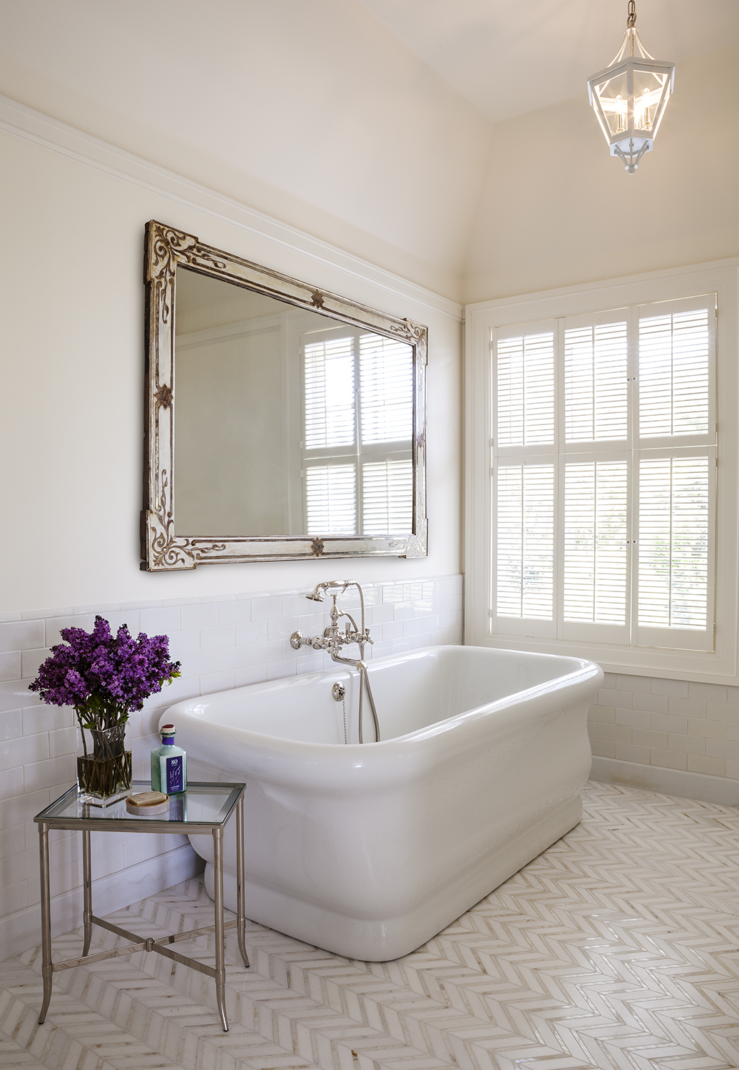
Heather Hilliard Design – Bath with a large-scale antique French painted & silver-gilt mirror from Garden Court Antiques
An antique mirror lends a classical touch to this clean, sophisticated bath designed by Heather Hilliard.
Overall the mood in this space is calm and open. Subtle grace is found in the beautiful herringbone-tiled flooring, the generous white tub & a fine large-scale antique painted & silver-gilt mirror. Ms. Hilliard found the mirror at Garden Court Antiques. Her deft touch using this antique piece in a contemporary setting unites the design with an established quality.
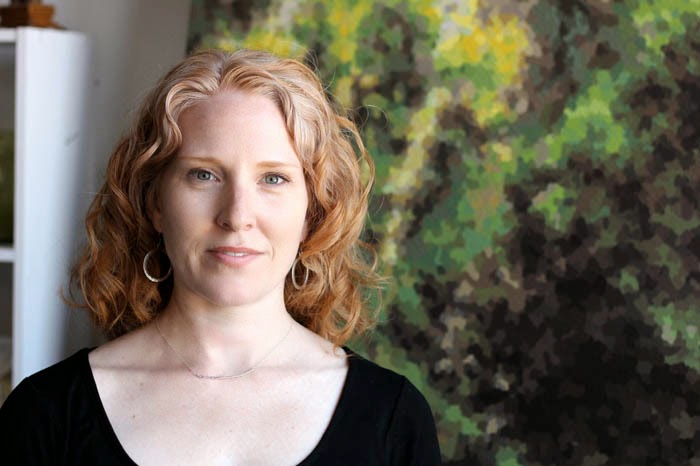
San Francisco Interior Designer, Heather Hilliard
Ms. Hilliard’s has a rich background in the fine arts, the natural sciences & business. She originally hails from the Lehigh Valley of Pennsylvania. She began her career in Philadelphia working with non-profits eventually catching the attention of “the quintessential blue-blood President of the Philadelphia Museum of Art” (..whose family inspired the 1940 classic romantic comedy, “The Philadelphia Story”)
From there Ms. Hilliard’s path took her to San Francisco, finding her way to the storied Interior Designer, Paul Wiseman & The Wiseman Group. Eventually, she opened her own firm, Heather Hilliard Design ^jh
I’m always thinking about the proportions, the sightlines, the focal points – things that maybe some people don’t consider. Other folks might be thinking more about the decoration, but I’m trying to think of it as a whole..
Heather Hilliard Design
San Francisco
3654C Sacramento Street
San Francisco, CA 94118
Tel. 415-673-1111 x113
Fax 415-366-2005
email: info@heatherhilliard.com
Los Angeles
10866 Wilshire Blvd., Suite 225
Los Angeles, CA 90024
Tel. 213-290-0029
In many respects it is predestined that artist, Elaine Coombs would live and thrive in San Francisco. This City’s urbane, innovative, yet intimate qualities are complemented by a surrounding wealth of verdant, lush wildnerness replete with trees, light, color, flora & fauna not found in many other cities. These are the qualities that initially drew Ms. Coombs, a native of Toronto, Canada, to San Francisco in 2000.
“San Francisco is a small yet cosmopolitan city – small enough to get to know people easily but big enough to not run into them all the time. And with the influence of the technological and creative wealth of the greater Bay Area, I think it is one of the most vibrant places in the world to call home”
Nothing but bright, acrylic on canvas over panel, 40×50 in
A grateful time, acrylic on canvas over panel, 50x40in
Preferring the poetic, acrylic on canvas over panel, 50x40in
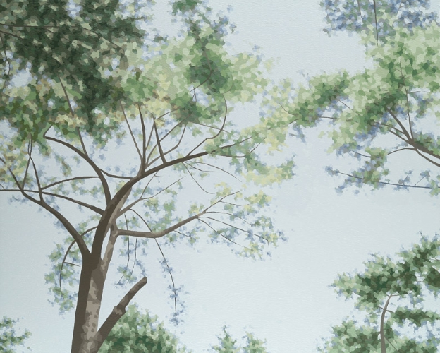
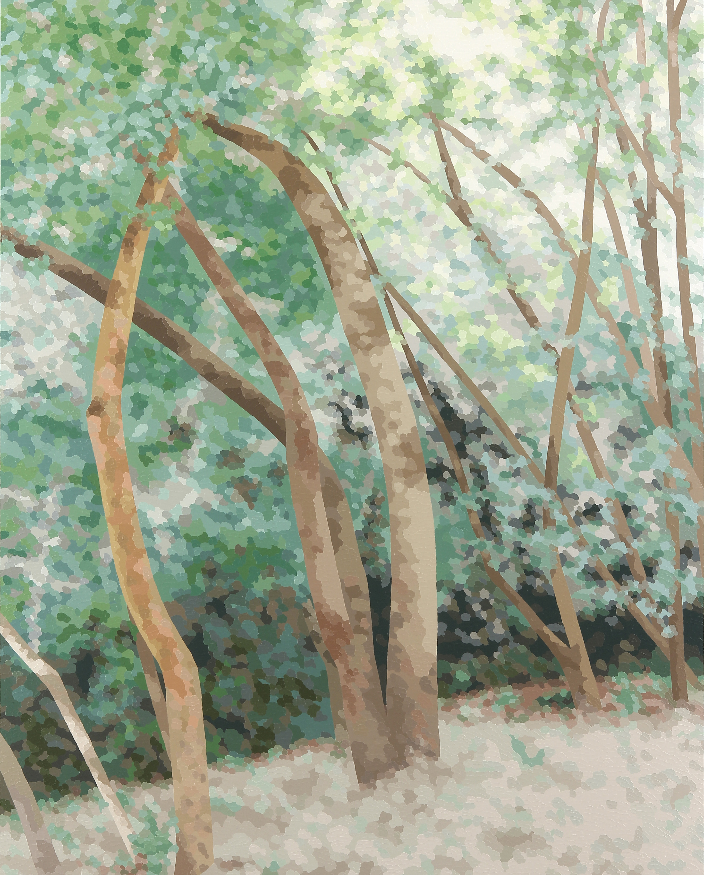
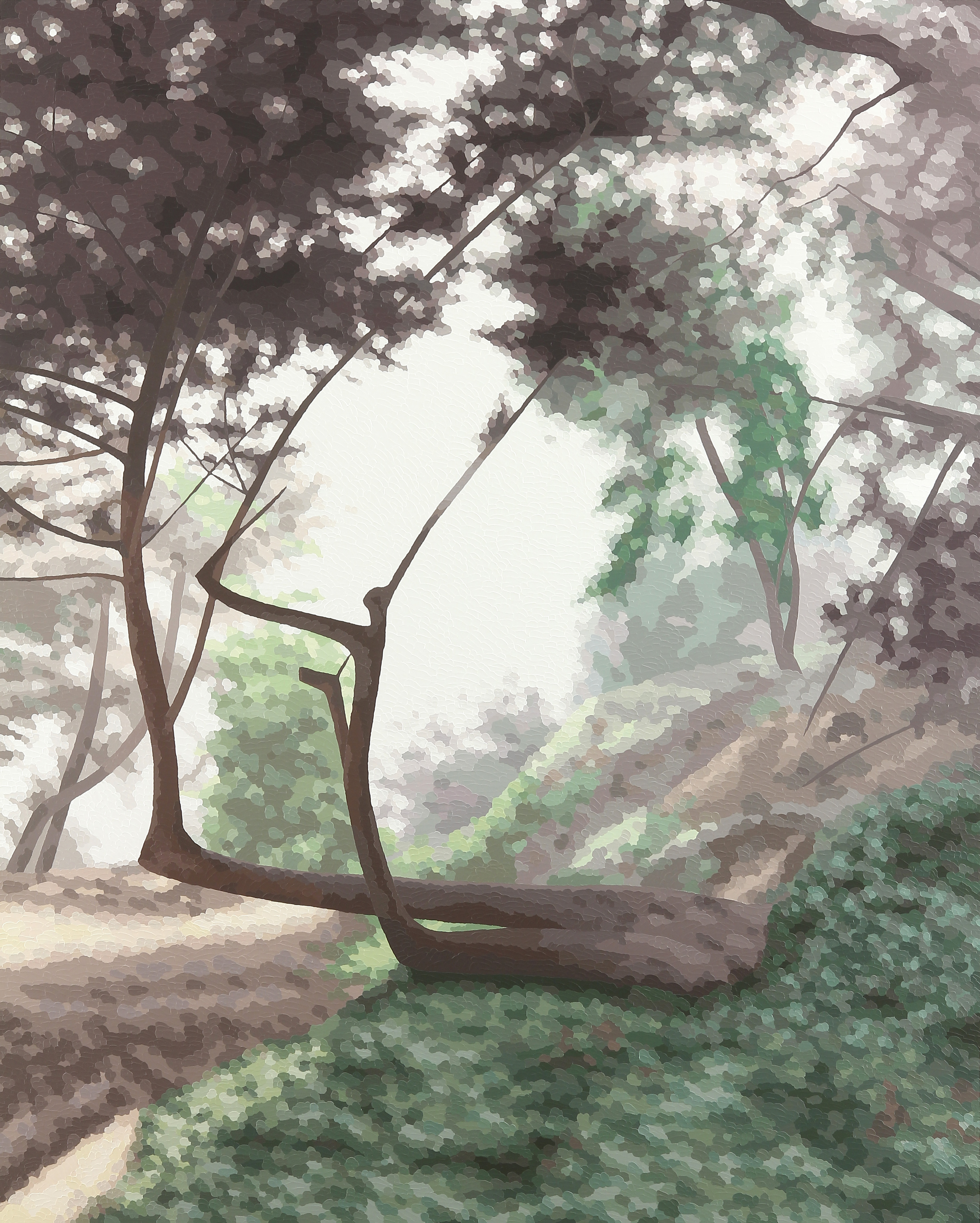
Ms Coombs’ uses photography in her creative process to capture light & shadow as she draws on the outdoors for inspiration. Walks through the nearby Muir Woods Redwoods Forest (which John Muir called “the best tree-lovers monument that could possibly be found in all the forests of the world.”) is a favorite ‘muse’ of hers. San Francisco’s iconic Washington Square Park in North Beach is another & the subject of a few works on display at Garden Court Antiques. As Coombs returns to projects, sometimes months later, these photographs serve as inspiration for her work.
Lengthy experimentation, what Coombs calls “playing around” has culminated in an artistic process of expertly placed dots of color that shimmer with light & depth which convey the artist’s deep connection with the outdoors. Coombs does not use a brush. Her art is created with knives, palette knives of wood & steel that flex offering her the perfect painting response.
“I can’t imagine going back to using a brush again to create an image. I even prime my canvases with a knife.”
But, maybe, its best we let the artist speak for herself:
Artist’s Statement:
There is something about being in nature that makes me want to seek out these spaces time and again. Perhaps it is a memory conjured from my rural childhood; positive feelings of comfort, stability and happiness come to mind easily. It seems whenever I simply need to regroup, breathe and return to center, it is the forest that can do this for me every time.
In the studio, I refer to printed photographs I have taken on my nature walks, which inform my acrylic paintings. Intuitively, my eye separates the patterns of color that I see in the photo and translates these into a complex mosaic of dots on the canvas. Over time, the methodical application of the dot technique has become in itself a meditation of sorts. I am peacefully absorbed in the process of painting the work, which I hope is imparted to the viewer with a pleasurable feeling of well-being similar to what I feel actually being in the forest.
My unique way of interpreting a photograph owes some debt to the digital age and to the proliferation of pixelated imagery that I have grown up absorbing. As an artist I enjoy the process of separating an image into parts, breaking it down and then building it up again in a slightly altered fashion. My work has the dual aspect of seeming realist from afar and yet is quite abstract at near view. It is this dichotomy, achieved in the successful play of opposite modes of seeing that I feel is the most contemporary aspect of my work.
Featured works by Elaine Coombs can be viewed at Garden Court Antiques presented by Art Consultant, Laurie Ghielmetti Interiors + Art. Additionly, Ms Coombs creates commissioned works in conjunction with a designer, art consultant or gallery exploring a client’s personal connection to their outdoor environs.
Elaine’s paintings have been exhibited both nationally and internationally in cities such as New York, Los Angeles, Seattle, San Francisco, Toronto, London, and Singapore. Her work has been seen in a number of publications, notably: California Home + Design Magazine (2007); Art Calendar Magazine (2009); and a new book entitled Green Art: Trees, Leaves and Roots (2014). Several notable collections have acquired her paintings; the U.S. Department of State – Art Bank Program, and the Ritz Carlton Highlands Hotel in Lake Tahoe, California – as well as numerous corporate and private collectors worldwide.^jh
Combining contemporary art alongside antiques reflect the way Interior Designers innovate with their design projects today.
Next time you visit the showroom at 151 Vermont you’ll notice ‘temporary’ exhibitions of contemporary works of art.
Let us know what you think.
Currently in the Showroom we are featuring photographic works from Napa Artist, Lewis deSoto in conjunction with Laurie Ghielmetti Interiors. These ephemeral images were staged in response to the ‘destructive process’ of Land Art, a defining element of Postwar American art.
Lewis deSoto ARTIST STATEMENT Site Projects 1980-1986
The Site Projects were the step between my purely photographic work of the late 70’s and early 80’s and the sculpture that was to take precedent by 1989. The work was a philosophical response to “earthworks” sculptors like Smithson, Heizer and DeMaria. What issue was taken, was the destructive process (I mean this in digital terms, where the original is destroyed as a piece of data is constructed); bulldozers marked and moved the earth to serve their metaphorical purpose.
The Site Projects used the site as a stage that left a dwindling trace of my work there. I added a temporal element that was echoed in many works that took place during long camera exposures at night. These works dealt with notions of power and scale; like Chinese landscapes, these works compared the scale of the human against the overarching embrace
of the world, the stars and the galaxies.
Most projects began with drawings, some formalized instructions that could be reengaged at a later date or by myself or other artists. This was, in part, a response to the ephemeral nature of color print photography at the time. Now these works can be translated digitally and placed on paper with pigments for permanent display. The desired print size of the work has also grown over the years, starting at 18” x 18” and ending at 30” x 30” sometime in the early 1990’s. I have engaged larger sizes now that these are translated to digital media.