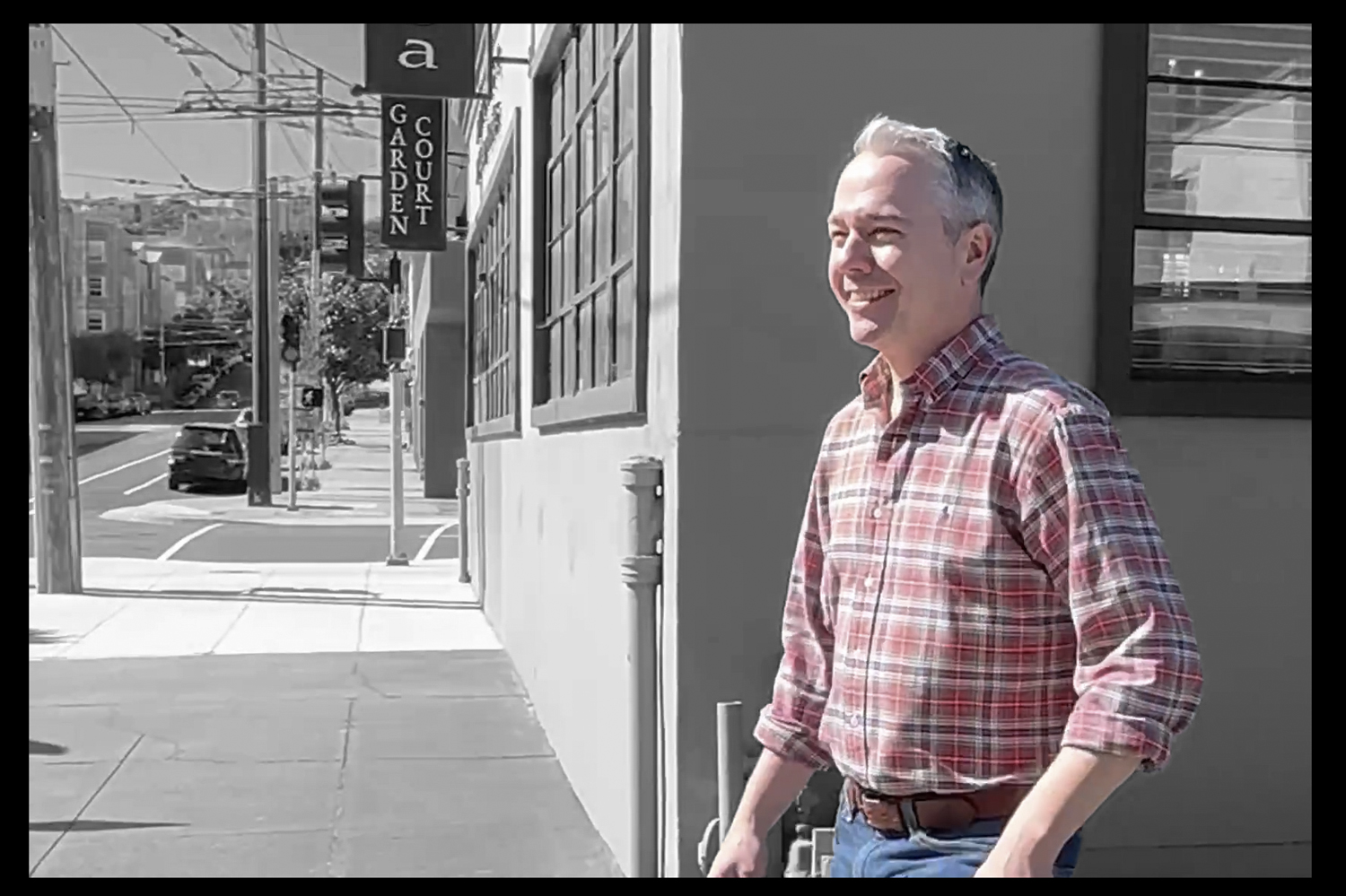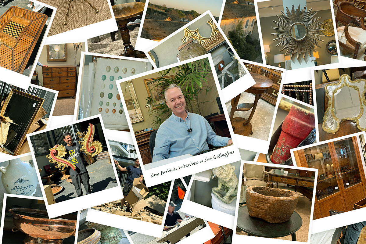
Friday, May 30, 2025 at Garden Court Antiques, San Francisco.
An edited transcript from a recent conversation with Jim Gallagher, owner of Garden Court Antiques, about his January buying trip to England and France, the current shipment, and trends in antiques and interior design.
The Buying Trip: England, France, and Market Shifts
Interviewer:
Jim, where did this year’s travels take you—and did any location surprise you?
Jim Gallagher:
We did the usual run: I flew into London, then to Paris for the flea market, then down to the south of France—Beziers, Montpellier, Avignon—before making my way back through the Cotswolds and parts of the Midlands. The biggest surprise was the shift in the Paris flea market. It used to be a great resource for early furniture, but now it leans toward reproductions and 20th-century pieces. Still beautiful, but clearly aimed more at interior designers than antique dealers. Thankfully, the southern fairs brought in remarkable things—dealers from Spain, Portugal, Italy—it was rich with possibility.
Interviewer:
Any particular markets or dealers that stood out during your twelve-day trip?
Jim Gallagher:
Every fair still brings that adrenaline. You’re queued up before dawn, espresso in hand, and when the gates open it’s madness. Dealers rushing to make offers, measuring, photographing, negotiating. We tried the Newark Fair in northern England this year—massive, but not quite for us. And possibly the coldest place I’ve ever been, and I say that as someone who went to college in Vermont.
Interviewer:
Would you say the French and English markets have changed in recent years?
Jim Gallagher:
Absolutely. Fewer Americans are shopping in person now, so English dealers are shifting focus to local clients or selling directly through platforms like 1stDibs and Chairish. That drives up prices but cuts out intermediaries. I still value the connections. There’s a dealer in Petworth, older than I am, who showed me this ingenious 18th-century leather sofa that pulls out into a bed. I almost bought it—until I realized I’d never sell it. He said, “That’s why it’s still in my shop.” Moments like that are why I still do this.
What Designers Are Looking For Today
Interviewer:
What are interior designers asking for these days?
Jim Gallagher:
It varies, but the one constant is the hunt for something singular—something that makes them stop and ask, “What is that?” Those are the pieces that make a room feel personal. They give a space its soul. Not everyone wants a huge piece anymore. More often, it’s about smaller elements—a table, a lamp, a box—that add a layer of individuality and depth.
Interviewer:
Is San Francisco different in how it uses antiques compared to other cities?
Jim Gallagher:
Very much so. I’ve been here for 30 years. There’s a creative, collaborative spirit to the design community in San Francisco. Designers come in, we look at the new arrivals together, talk about their projects. That dialogue—between maker, dealer, and designer—is part of why I love this work.
Highlights from the New Shipment
Interviewer:
Let’s talk about the shipment. Which pieces caught your eye when they arrived?
Jim Gallagher:
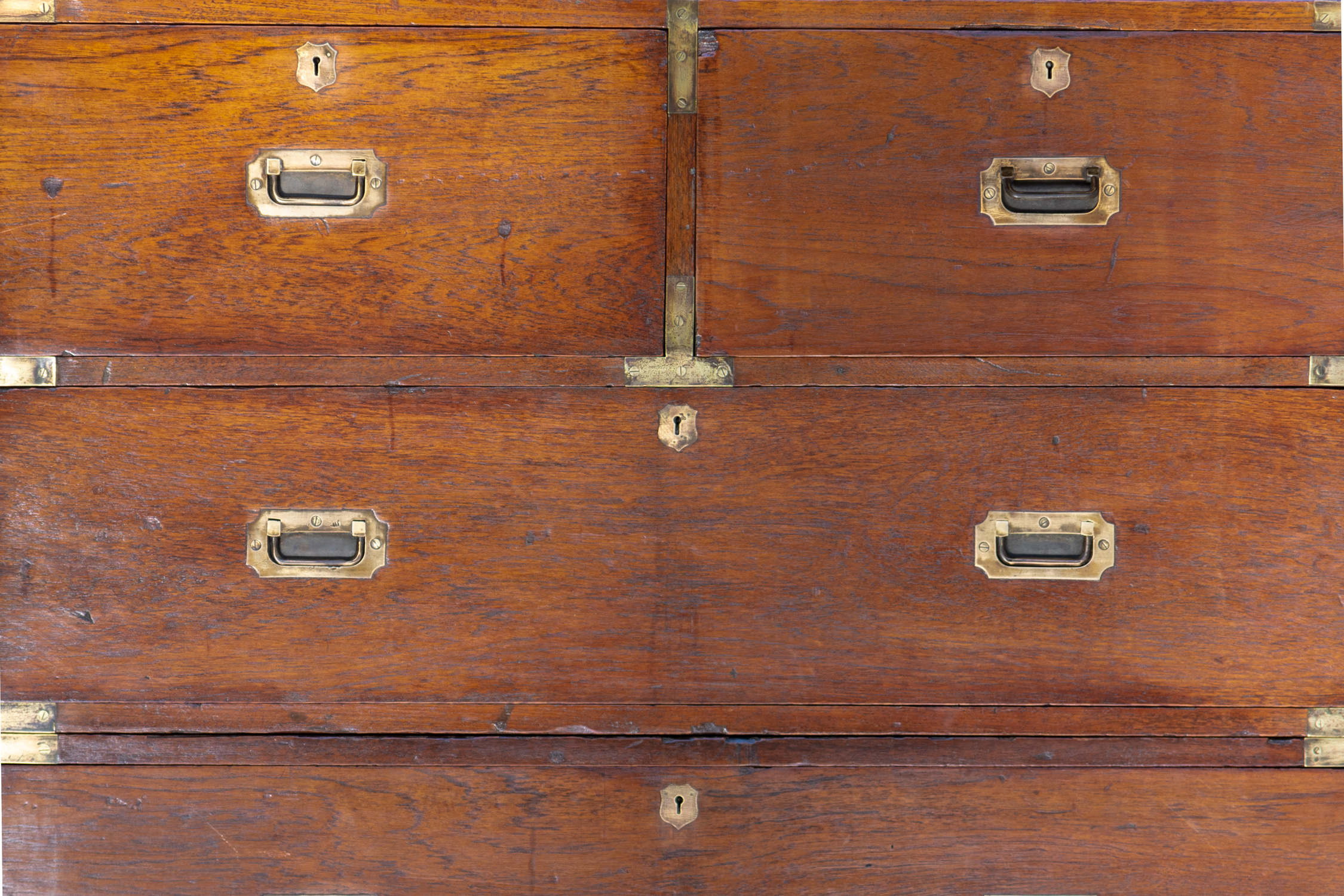
I love them all—but I was especially taken by the early Spanish and Portuguese pieces. Deep turnings, rich woods, fantastic character. One bench sold on day two, which is always bittersweet. And then there are small things, like a framed 1930s Babar print I might keep for myself, or a rustic carved burl bowl. Campaign furniture also stands out—streamlined but elegant, perfect for traditional or modern interiors.
Interviewer:
Was there a piece you’d keep if you could?
Jim Gallagher:
That’s the challenge in this business—you fall in love with these pieces. But I remind myself: I’m a dealer, not a collector. I get to live with something for a while, then let it find its next home. And then I fall in love with the next thing. It’s always about the hunt.
Interviewer:
Did anything surprise you once it got to the gallery?
Jim Gallagher:
Absolutely. A bench with an extraordinary patina sold before I could really appreciate it. Another piece—a cabinet I bought in a rush—turned out to be meticulously veneered in bookmatched burl. It’s nice when a piece exceeds your expectations in person.
On Style, Soul, and Selection
Interviewer:
What gives a piece “soul”?
Jim Gallagher:
Care. Age. Use. A piece that’s been looked after for centuries carries its history with it. Waxed, polished, touched over and over again—it’s like literature. I studied English Lit, and a great antique is like a great novel: it transports you. Except you can live with it, touch it, make it part of your daily life.
Interviewer:
What’s the most eccentric or unexpected piece in this shipment?
Jim Gallagher:
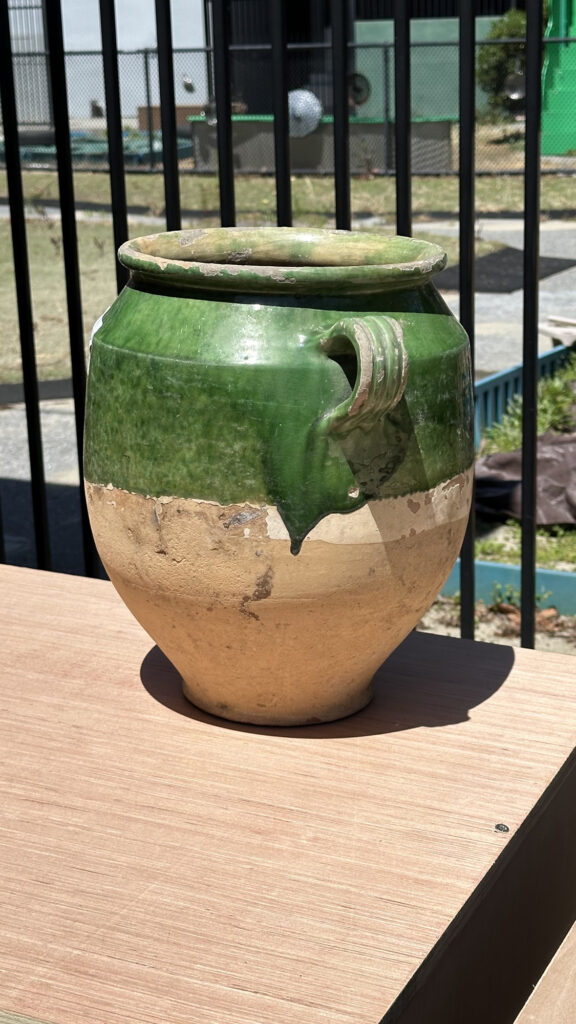
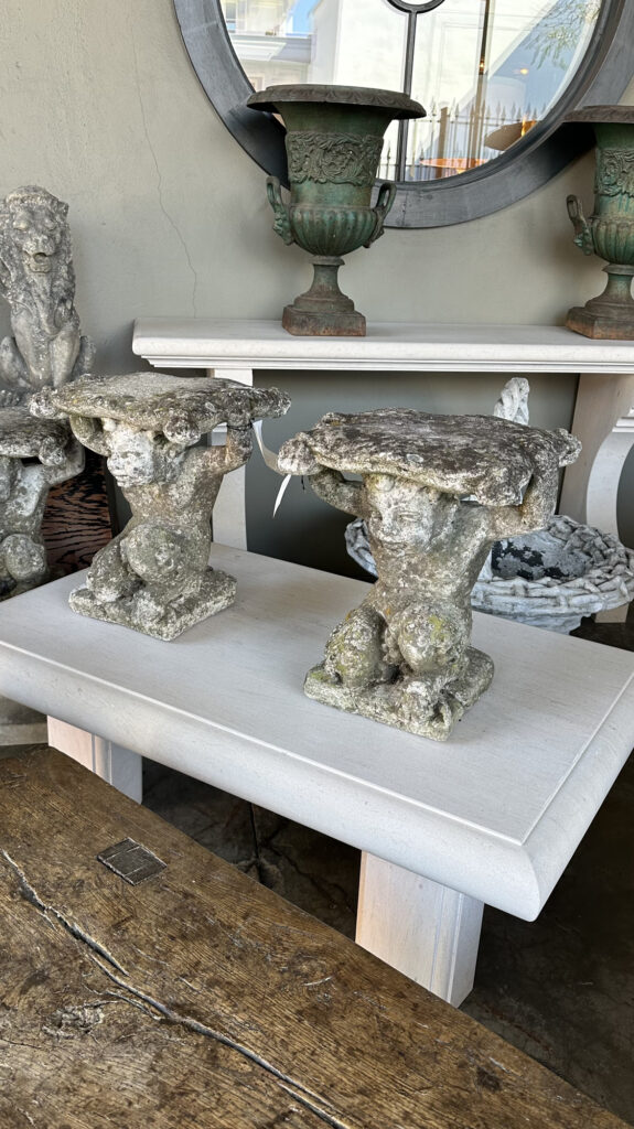
A pair of oversized urns, some charming cement bulldogs, and a little pig with piglets. Also, some faux bois garden furniture from early 20th-century France—cast stone made to look like wood. Each piece with a little personality of its own.
Reflections on the Business of Antiques
Interviewer:
Was this year a continuation of last year’s direction—or a shift?
Jim Gallagher:
A continuation, but with a broader reach. I want the gallery to feel like a celebration of makers from the last 500 years. Not dusty. Not static. I even bought a few 20th-century Deco and drinks tables—things I wouldn’t have touched ten years ago—but they were just good. It’s less about sticking to a period, more about quality and surprise.
Interviewer:
Any moment on this trip that crystallized why you still do this?
Jim Gallagher:
Not one moment—dozens. You find something extraordinary, meet the person who brought it, learn something new. It’s not glamorous—it’s 12-hour days, 16,000 miles in 12 days—but it’s a privilege. Finding something special, restoring it, then placing it with someone who loves it—that’s the reward.
Interviewer:
What’s harder now than it used to be—and what’s easier?
Jim Gallagher:
Harder? The Paris flea markets aren’t what they once were. And I’m 53—jet lag’s no joke. Easier? I know what I’m doing now. I trust my instincts. And I can afford a better dinner at the end of the day. That helps.
Interviewer:
Any final thoughts?
Jim Gallagher:
Come visit. Ask questions. Bring your young designers. If you want to nerd out about patina or joinery, we live for it.
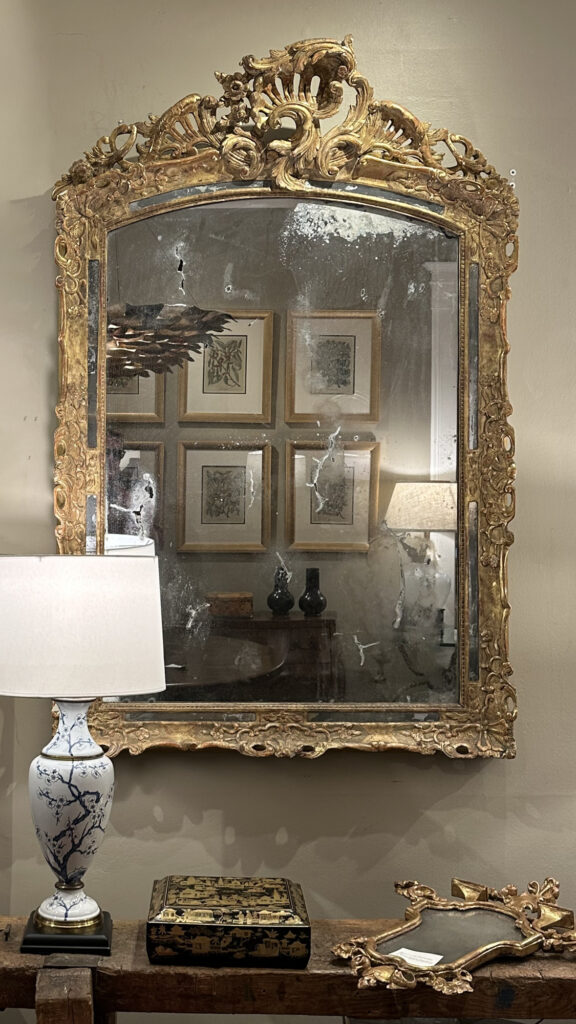
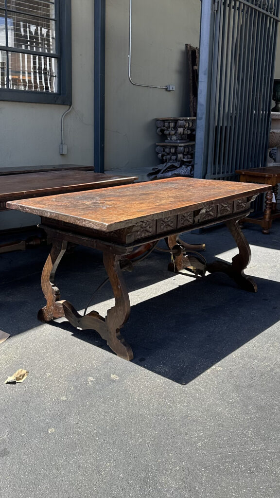
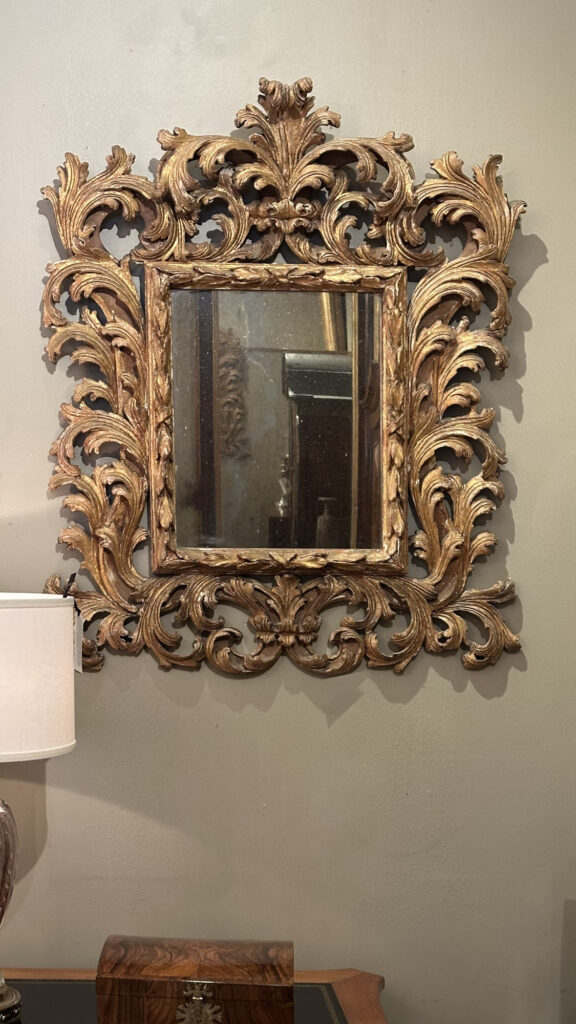
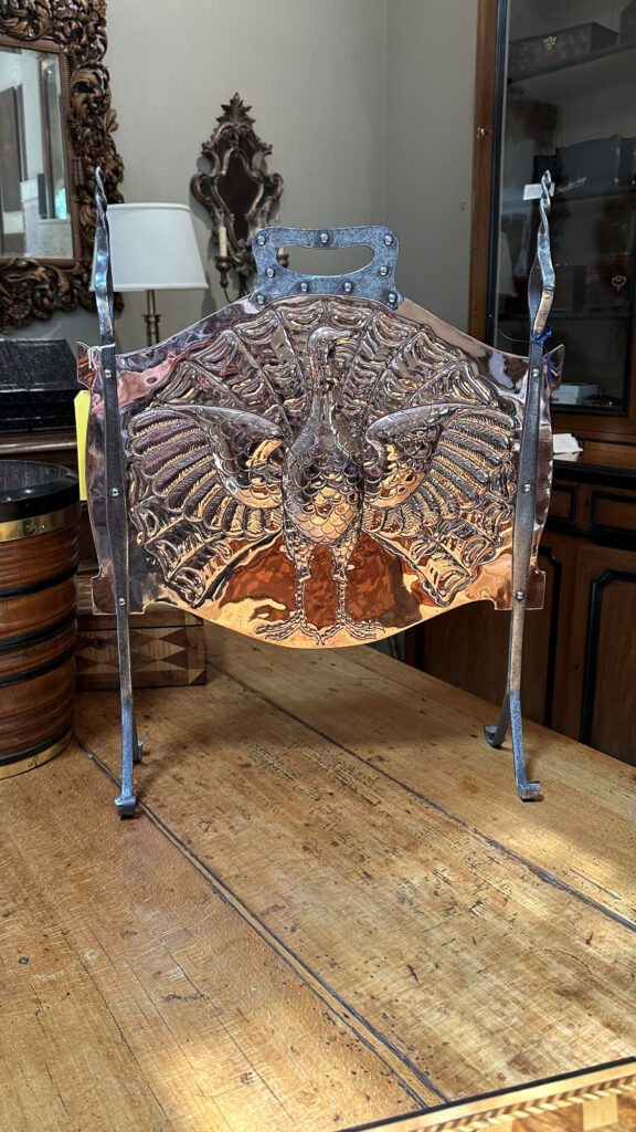
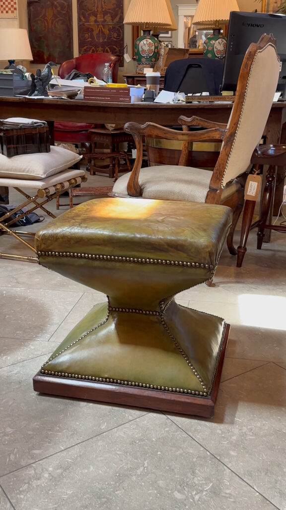
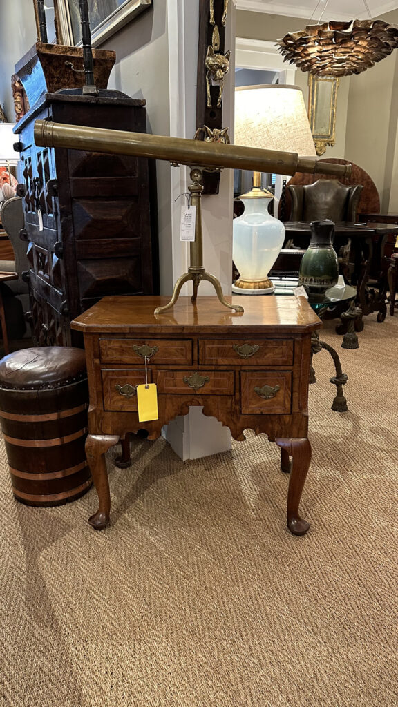
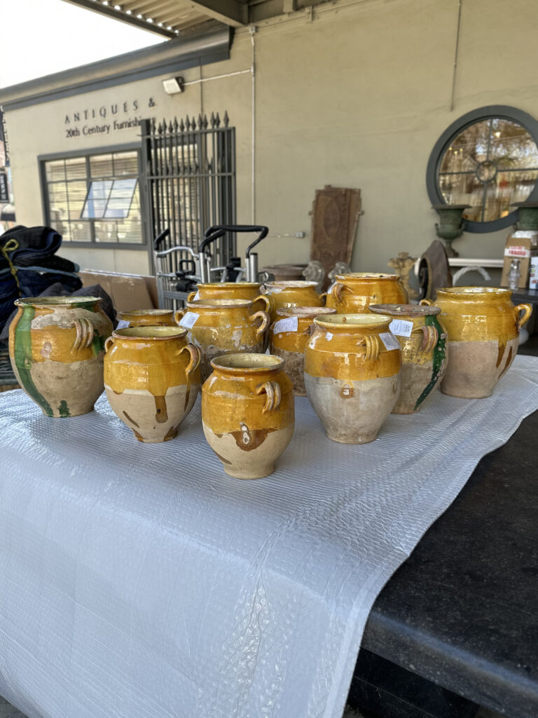
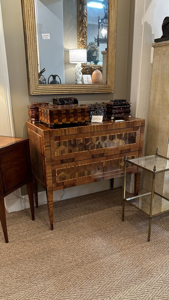
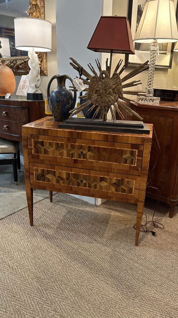
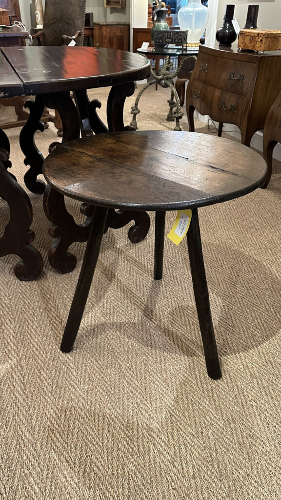
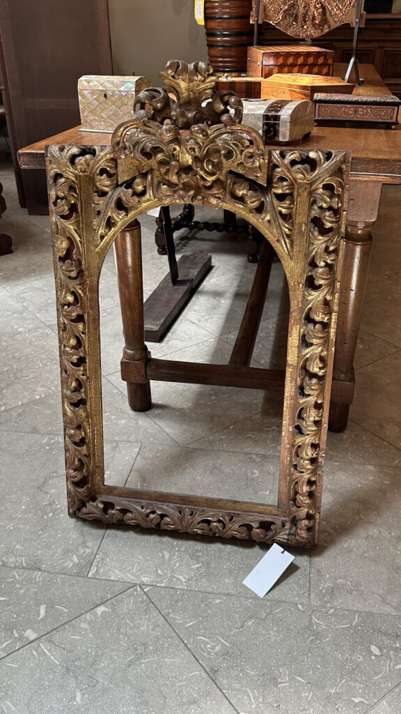
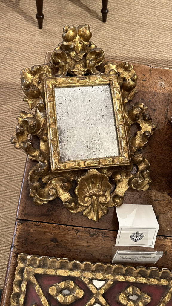
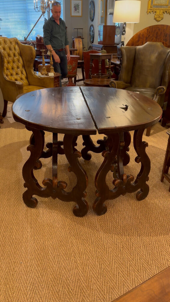
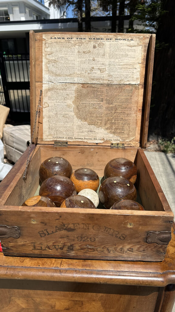
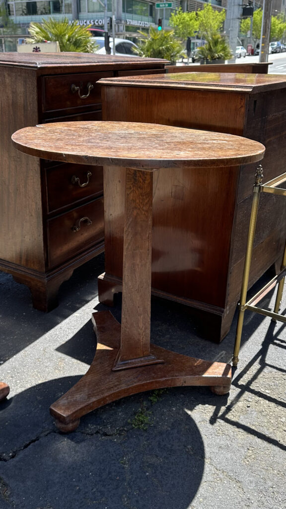
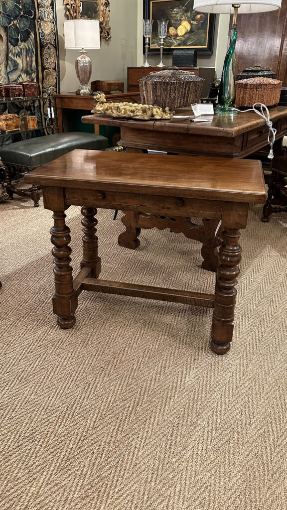
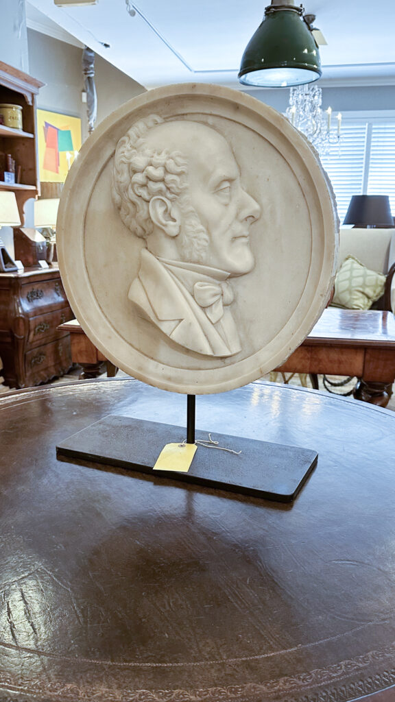
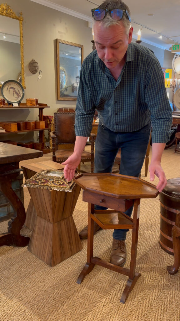
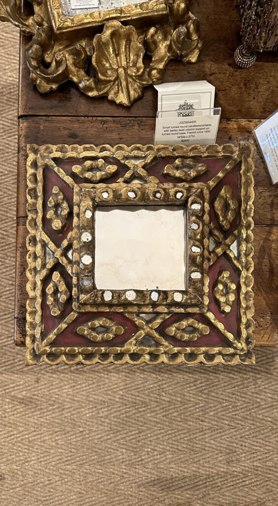
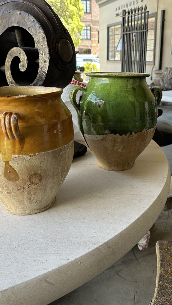
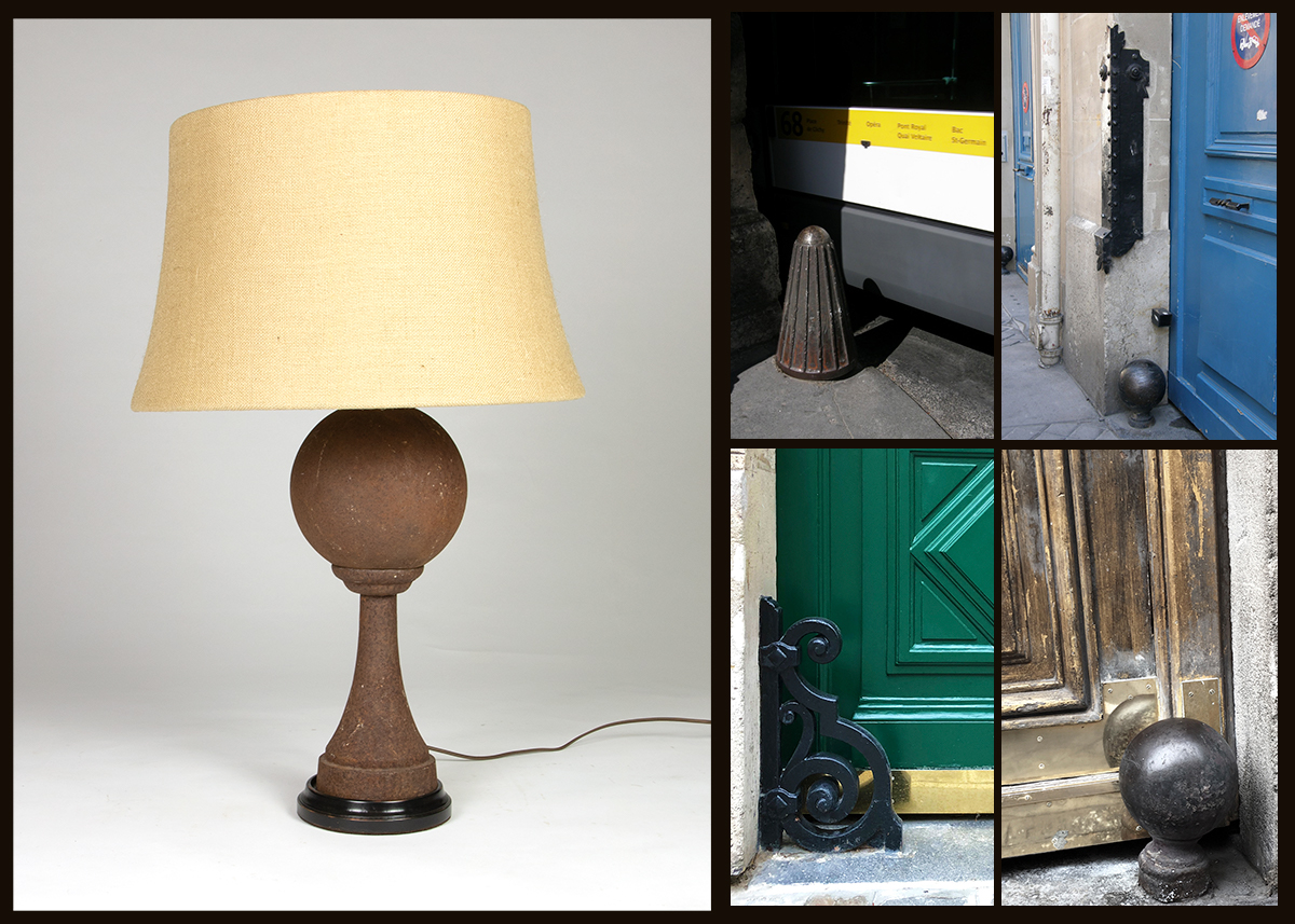
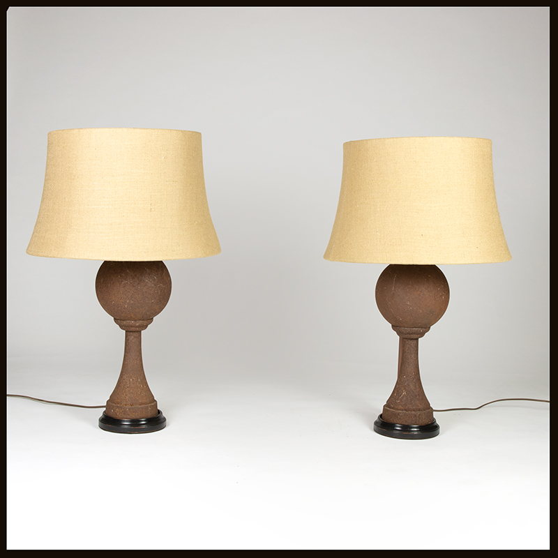
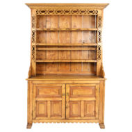
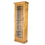
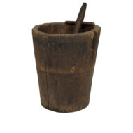
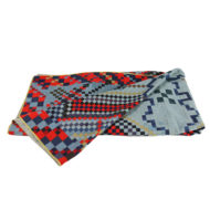
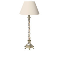
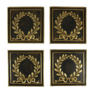
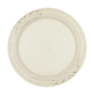
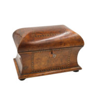
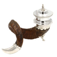
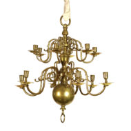
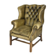
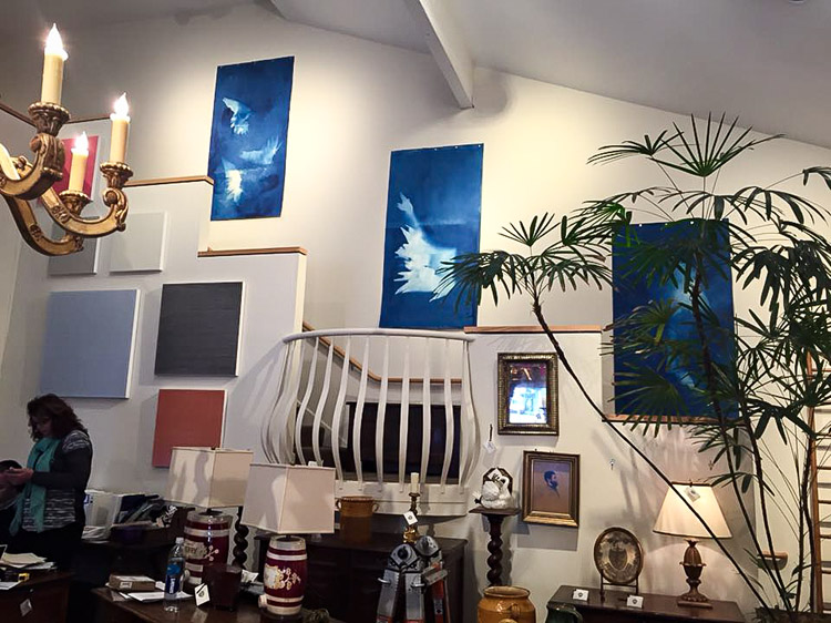
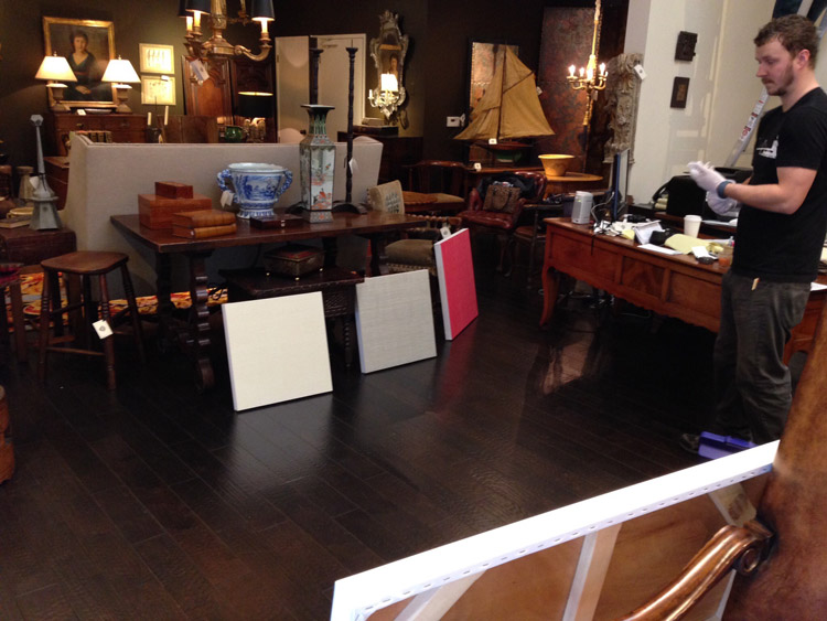
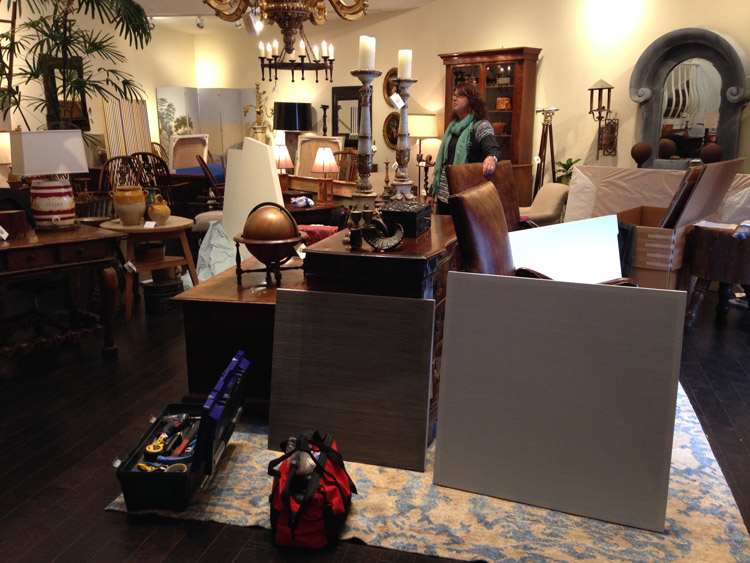
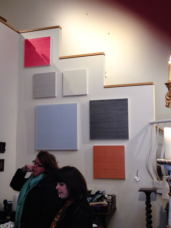
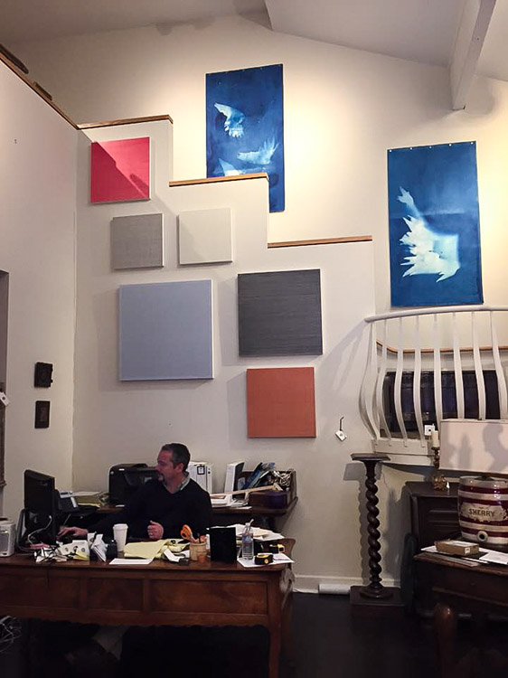
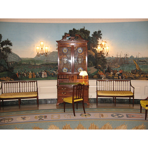
Gallery: Selections from the May 2025 Shipment
A closer look at some of the new arrivals on display at Garden Court Antiques.


^jh